there are still some things in print you can’t do in…
April 5, 2009
“Wallpaper* strives to keep its edge with guest eds and die-cuts
Print can still do lots of things you can’t do online, and one of the more striking and tactile techniques in the print designer’s armoury is die-cutting, writes John L. Walters. The October issue of Wallpaper*, out next Thursday (11 September), goes to town with some sculptural custom cuts – in a special sixteen-page section, and on one of the three alternative front covers. But they don’t appear to be the kind of gratuitous ‘paper porn’ you see in elaborate paper promotions, or in limited-edition laser-cut book art like Olafur Eliasson’s (admittedly rather beautiful) Your House. This is a mass-market mag with a print run of 200k, destined for your local newsagent.
We’ve not managed to get our hands on a copy yet, but these snaps show something of the way this labyrinth of die-cuts springs from the content provided by Zaha Hadid, one of three guest editors. (The other two are artist Louise Bourgeois and Comme des Garçons founder Rei Kawakubo.) Hadid’s reputation rested on two-dimensional work on paper (see ‘The architect as illustrator’ by Catherine Slessor, Eye no. 35 vol. 12) long before she built anything substantial, so it is no surprise to see her work in the medium of a magazine. (She contributed a limited edition cover to the May 2006 Wallpaper*, too.) The gatefold cover and cut pages represent Hadid’s Lotus, to be launched at the Venice Biennale next Friday (12 September).” via eye blog


mwm graphics
April 5, 2009
diversity and quality are two things coming to mind when i look at what matt w moore does professionally. he is a designer, illustrator and generally a creative mind i guess. and, it’s pretty hard to stand out these days where you can find pretty much everything over and over again, where the same thing with just a different name on the tag is only a mouse click away.
doesn’t happen that often that you find someone who does wallpapers, snowboards, art, packaging and other stuff with such a high quality level and unique style.
check out his site and work. mwm graphics


artless, shun kawakami
April 1, 2009
pretty interesting guy this shun kawakami from japan. born 1977 in tokyo he became an artist and designer, co-founder and head of artless inc. an art and design studio that focuses mainly on graphic arts and design, interactive, installation, video and exhibition.
get lost on the artless website, pretty interesting, the site itself as well as their work – artless.co.jp


“pins and threads” by debbie smyth
March 17, 2009
like this a lot! it is art that’s not only thoughtful but also artful and artistic in a literal sense. on a first glimpse just black and white, 2d graphical that turns with the second look into a delicate and complex 3d installation. debbie smyth was selected as one of the most promising graduates of 2008 for the dezeen talent zone. her installation pins & threads uses, as the title suggests, sewing pins and black thread to draw a series of electricity pylons across several canvas panels.
the technique transforms ordinary structures — often thought of as ugly blots on the landscape — into beautifully minimal graphic drawings, which are at once 2D and 3D, anchored to their panels but also floating in space.
debbie smyth graduated from the west wales school of arts in 2008 and describes herself as a constructed textile artist. her work employs “an array of mechanisms, she folds, collapses, inflates and interlocks her materials to transform two-dimensional lines and planes into three-dimensional shapes and space.”

visual crap
March 13, 2009
allright, how many more times do i need to see a toilet paper in combination with a space to put down a killer idea? no more! same counts for napkins of all kind. we’ve seen it. ok? if this is advertising for a visual arts school then better do something that’s fresh, as the next guard of visual artists should be, and first and foremost: think! as claimed.
also, i bet in most cases there is going to be still crap on that toilet paper no matter if you wipe off your brain or a…

jay z typography
March 12, 2009
brooklyn (go hard), interesting video but it would have been nice to form the face out of the lyrics versus just the brooklyn. anyways refreshing to see from jay z instead of some worn out gangster stuff, quite stylish.
magicsocket
March 11, 2009
as the guys from magicsocket describe themselves they are an agency specialized in the creation of digital products based on adobe flash technology and an ideal partner for advertising agencies. their site looks cool and somewhat different, the game really works (try racing) and the work they do is pretty good. check it out at:
http://www.xfactor2008.unit9.com


op art
January 4, 2008
dave bollinger has created a series of works that are similar to op-art, squeezing the same basic shape into atightly packed and dense array. bollinger suggests, ‘most of these are intended to be viewed “from a distance” as a whole, not studied in detail up close’. the simple shapes create mesmerizing patterns that play with the eye, similar to optical illusions. well, i’d say after 10 minutes of starring on them i can see complex figurative images of dancing cows and other things. try that!


herbaceous planted fashion retail shop
December 20, 2007
mass studies is a korean based architecture firm that was founded in 2003 by minsuk cho in seoul. the studio recently finished the design of shop for fashion retailer ann demeulemeester. the building consists of four levels, the shop, a multi-store and restaurant on the top floors. the project’s facade is made from a geo-textile planted with herbaceous perennials to form a living wall. the greenery is carried into the shop, incorporating nature whenever possible. the studio focuses on issues involving density and living in urban korean areas. the shop’s location is in a residential neighborhood that is evolving into a shopping district.


rdi awards
December 20, 2007
the 2007 ‘royal designer for industry’ awards were given out early this month, honoring 6 uk designers; in addition 6 international designers, received ‘honourary royal designer for industry’ distinctions. the awards were set up by the ‘royal society for the encouragement of arts, manufactures & commerce’ in 1936 to encourage high standards in design. only 200 designers can hold the distinction at any time, making it one of the most highly regarded design honours in the uk. the distinction of ‘honorary royal designer for industry’ is also only awarded to a limited number of designers.the 2007 ‘rdi’ awards were given to edward barber and jay osgerby, nigel gee, margaret howell, ben kelly and simon waterfall. the honourary ‘rdi’ awards were given to naoto fukasawa, antonio citterio, john lasseter, mark pollack, erik spiekermann and piero tosi.
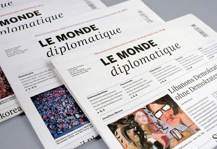 the “le monde” newspaper design by erik spiekermann
psyop
November 11, 2007
another (not recently released but still cool) visually intriguing piece directed by todd mueller and kylie matulick (produced by psyop). the new york motion animation and special effect house psyop is run and owned by both todd and kylie, but compared to many competitors they do direct and create a lot of their work inhouse and don’t concentrate on special effects only. nice shop.
florence & johann
November 10, 2007
florence tétier and johann besse are a lausanne, switzerland based graphic design, photography and illsutration team (not a couple) which finished studies in 2006, graduating from ECAL – an in 1821 founded fine and applied art school, now officially university of art and design.
the two have an interesting mix of disciplines and work on their site. often combining different media to create its own style. i’d describe it as somwhere between psychedelic introverted and forward agressive.


make my logo bigger
October 30, 2007
take a look at this funny web video. unfortunetaly for those who work in design and all related fields they do know that there is a lot of truth to it. painful client meetings to eliminate white space and increase logo sizes. although i have to say, some designer take it to the extreme opposite direction. does someone know a website which “promotes” that? make my logo smaller (so i can’t read it at all anymore). but seriously the “make my logo bigger” video and website is funny.

richard may
October 24, 2007
richard may, co-founder of wyld stallyons, pixelsurgeon and black convoy is an artist, illustrator and designer who has published editorial work for clients such as time, ray gun, wired, vogue and many more as well as commercial work for nordstrom, waterstones and the french car manufacturer peugeot. he also did numerous exhibitions showing is art work. think his unique and expressive style, mixing graphical 2d and photo 3d elements, is great. while most of his work is not “loud” and busy at all there is quite a bit of depth in his work that you need time to explore all details in it.


